Media
By default, SFUMATO makes all <img> tags responsive, willing the width of their container (up-scaling).
There are patterns you can follow as well, for things like responsive images and video embeds. These types can have captions, and will also break out of their containers and fill the width of a mobile display using negative margin.
Patterns
The following are media patterns provided by SFUMATO.
Responsive video
Use this pattern to display a responsive, scalable video embed with optional caption.
-
<div sf-video-wrapper>
The contents of this wrapper will be a responsive video container and optional caption. -
<div role="video">or<video>
The contents of this wrapper will be a responsive video. The video embed is in this container. -
<small>
Optional for captions.
HTML
Responsive image
Use this pattern to display a responsive, scalable image with optional caption.
-
<div sf-image-wrapper>
The contents of this wrapper will be a responsive image container and optional caption. -
<img>
This is the image. -
<small>
Optional for captions.
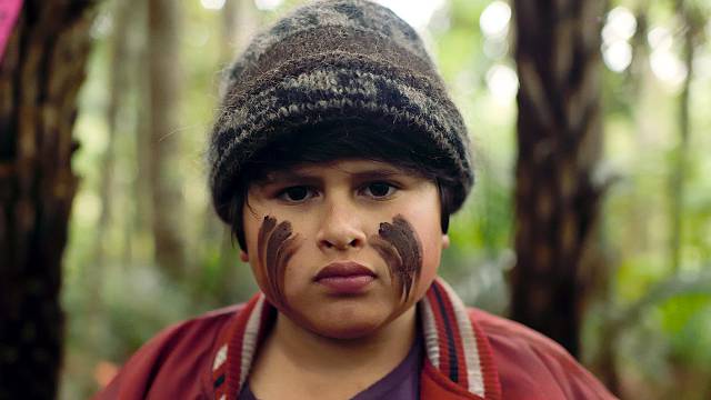 This is a responsive image caption.
HTML